Note
Go to the end to download the full example code.
Multiple Figures#
This example demonstrates generating multiple figures in a single example. Each figure is displayed in sequence with accompanying explanatory text.
import matplotlib.pyplot as plt
import numpy as np
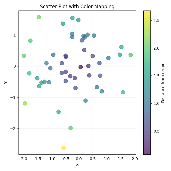
First Figure: Scatter Plot#
Random scatter data with color mapping based on distance from origin.
np.random.seed(42)
x = np.random.randn(50)
y = np.random.randn(50)
colors = np.sqrt(x**2 + y**2)

plt.figure(figsize=(6, 6))
plt.scatter(x, y, c=colors, cmap="viridis", s=100, alpha=0.7)
plt.colorbar(label="Distance from origin")
plt.xlabel("X")
plt.ylabel("Y")
plt.title("Scatter Plot with Color Mapping")
plt.grid(True, alpha=0.3)
plt.tight_layout()
plt.show()
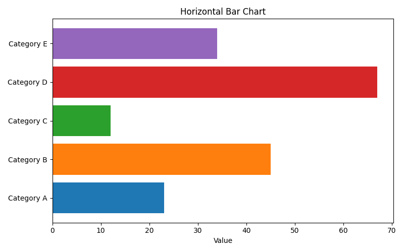
Second Figure: Bar Chart#
Categorical data visualization using a horizontal bar chart.
categories = ["Category A", "Category B", "Category C", "Category D", "Category E"]
values = [23, 45, 12, 67, 34]

plt.figure(figsize=(8, 5))
bars = plt.barh(categories, values, color=plt.cm.tab10.colors[:5])
plt.xlabel("Value")
plt.title("Horizontal Bar Chart")
plt.tight_layout()
plt.show()
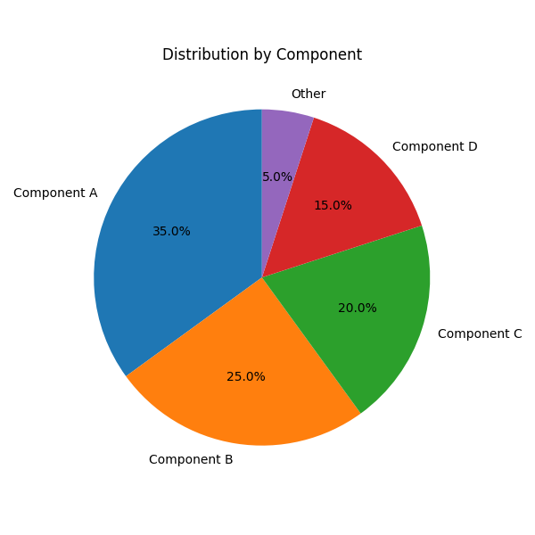
Third Figure: Pie Chart#
Proportional data shown as a pie chart with percentage labels.
sizes = [35, 25, 20, 15, 5]
labels = ["Component A", "Component B", "Component C", "Component D", "Other"]

plt.figure(figsize=(6, 6))
plt.pie(sizes, labels=labels, autopct="%1.1f%%", startangle=90)
plt.title("Distribution by Component")
plt.tight_layout()
plt.show()
Total running time of the script: (0 minutes 0.195 seconds)